Thursday, 18 December 2014
Editing - Colour Grading.
After making the final edit we need to make the final adjustments. We are now in the process of colour grading the video, we are adding various tints for different scenes, for example a grey/black and white colour for the church narrative, a grimy, green/red colour for the bathroom/kitchen scenes and dark colours for the performance in the forest. Colour grading the video makes it look so much better, and the colours chosen suit our track and genre.

Digipak progress.
Today in class I created the title for the front cover of my digipak, I picked a cool looking font from the website da font, I felt this fit our genre as it looked quite religious and symbolic. I edited the font in photoshop, as you can see I added a grey colour that I blurred and faded, this gave it a gravestone look which I thought looked good as it fits our narrative. I also tinted this with a red colour to symbolise blood.
For the rest of the panels I might go for a darker look with that blends in with the front covers background.
For the rest of the panels I might go for a darker look with that blends in with the front covers background.
Saturday, 6 December 2014
Finished Media page.
Today I have finished the media page on my website. The media page consists of our latest track, YouTube videos, and social feeds. I made this page very interactive to engage the audience, I have also included a forum so people could chat on the website.

As you can see I have included three YouTube video's that tell my fans about upcoming gigs and competitions ect. I have added a live feed of my instagram and twitter posts along with my track that the viewers can listen to.
Friday, 5 December 2014
Kitchen Scene
Last night we filmed the last part of our narrative in charm wood kitchen, the filming was very successful and after looking at some of the footage after I am pleased. Filming the last scene was tricky as it involved making sure the meat looked like guts by getting the right angle. We also had problems involving getting a shot where the priest picks me up and puts me on the table, but in the end we managed to get the shots.
Here are some photos of the props we used and the setting itself:


Here are some photos of the props we used and the setting itself:
As you can see the setting looked gloomy and fitted our genre perfectly and I'm sure it will look good in our video.
Thursday, 4 December 2014
Planning for filming tonight.
Tonight we are going to be filming the last narrative section of our video, in preparation I have bought some kidneys to make it look like the priest is taking my guts apart. We also have fake blood that we can use.

Hopefully the filming goes well and we have some good footage that we can use.
Hopefully the filming goes well and we have some good footage that we can use.
OFFICERS X GARY NUMAN - PETALS (VIDEO TWO: EXTENDED CUT)
Today in class we came across a video by the officers which looked great and fitted our genre perfectly. The narrative was a guy getting surgery why he is still awake. We thought this was an interesting concept and have come up with an ending scene for our video from inspiration from this music video.
As the priest has killed me and is dragging me through the forest, we thought it would be interesting to follow on from this. We had an idea that the priest would take me back to his home and kill me by cutting me up. We thought this would look great as the gore would suit our track and the genre and we have seen gore through many of the video's I have analysed in the past.
We have found a location in school that we can use which is charmwood, inside the kitchen. This is the perfect location as it has many utensils we can use along with the metal table we wanted. We are going to do a sequence of shots of the priest dragging me through the kitchen (in his house) and then putting me on the table. We are going to have one camera over the top of me capturing my facial expressions, this will be a mid shot. Then we have other shots such as the priest pulling the meat apart and sharpening knifes ect.
This is the video that gave us the idea. As you can see it uses dark lighting for the table scene and a mid shot of the guy showing his facial expression as he is getting torn apart. We will also use this as the ending, we are going to have the priest washing his hands in blood and then walking off while placing his bible down on the table. This will show that the killer has paid for his sins.
As the priest has killed me and is dragging me through the forest, we thought it would be interesting to follow on from this. We had an idea that the priest would take me back to his home and kill me by cutting me up. We thought this would look great as the gore would suit our track and the genre and we have seen gore through many of the video's I have analysed in the past.
We have found a location in school that we can use which is charmwood, inside the kitchen. This is the perfect location as it has many utensils we can use along with the metal table we wanted. We are going to do a sequence of shots of the priest dragging me through the kitchen (in his house) and then putting me on the table. We are going to have one camera over the top of me capturing my facial expressions, this will be a mid shot. Then we have other shots such as the priest pulling the meat apart and sharpening knifes ect.
This is the video that gave us the idea. As you can see it uses dark lighting for the table scene and a mid shot of the guy showing his facial expression as he is getting torn apart. We will also use this as the ending, we are going to have the priest washing his hands in blood and then walking off while placing his bible down on the table. This will show that the killer has paid for his sins.
Wednesday, 26 November 2014
Starting my Digipak
I have started to plan some ideas for my digipak. At the moment I have chosen an image from the photo-shoot we did to be the main focus on my digipak. The image is a close up of me with my eyes closed, however we have manipulated the image to make it look like I am fading away. This suits our track and narrative and the colour scheme also suits our genre. We are thinking of having this as a central image and on the outskirts having the lyrics od the track and legal information ect.

Website Progress.
I have recently made some adjustments to some of the pages on my website.
On news page, I took some inspiration from some news story's from websites in my genre. The first headline I added was our band being featured as a guest on Radio 1. I added this as a real band would need to promote their new single/album release, I thought Radio 1 would be the most suitable UK radio station as they feature many rock bands on their station and are also one of the main stations in the UK.
The second article I published illustrated that our band would be releasing a new album with roadrunner records, in the article I mentioned who produced the track and where it was made to make it look like a professional article.
The final article introduced our new single, promoting the single and where to purchase the track.
I tried to make the news page as relevant and professional as possible with detailed descriptions with real company's. I have also included pictures matching the articles as this features on the Mushroomhead's website.

On news page, I took some inspiration from some news story's from websites in my genre. The first headline I added was our band being featured as a guest on Radio 1. I added this as a real band would need to promote their new single/album release, I thought Radio 1 would be the most suitable UK radio station as they feature many rock bands on their station and are also one of the main stations in the UK.
The second article I published illustrated that our band would be releasing a new album with roadrunner records, in the article I mentioned who produced the track and where it was made to make it look like a professional article.
The final article introduced our new single, promoting the single and where to purchase the track.
I tried to make the news page as relevant and professional as possible with detailed descriptions with real company's. I have also included pictures matching the articles as this features on the Mushroomhead's website.
Thursday, 20 November 2014
Audience Feedback.
After a week of editing me and Toby have constructed a rough edit of the performance section of the song. We thought it would be helpful if we got some audience feedback from the class.
After showing the video in class here's the feedback that got given:
- Some of the shots where a bit shaky and placed straight after still shots. This doesn't fit so we will make sure we don't put a shaky shot next to still shots.
- The contrast of lighting from dark to very bright doesn't really go so we will have to use after effect to darker the outdoor clips.
- Use more enclosed shots in the church with the dark lighting .
-Add more quick cuts of clips as it looked good.
-Concentrate now on the narrative.
Overall what we have done so far looks promising and fits the genre, however needs improvement.
After showing the video in class here's the feedback that got given:
- Some of the shots where a bit shaky and placed straight after still shots. This doesn't fit so we will make sure we don't put a shaky shot next to still shots.
- The contrast of lighting from dark to very bright doesn't really go so we will have to use after effect to darker the outdoor clips.
- Use more enclosed shots in the church with the dark lighting .
-Add more quick cuts of clips as it looked good.
-Concentrate now on the narrative.
Overall what we have done so far looks promising and fits the genre, however needs improvement.
Thursday, 13 November 2014
Website progress.
Over the past few lessons I have made some adjustment's to my website.
The first being introducing a welcome page, I thought this would be a great idea as most website have this before you enter the page:


The first being introducing a welcome page, I thought this would be a great idea as most website have this before you enter the page:

This will be the first page the visitor gets to, I have put the band title 'LOST CAUSE' in the middle of the page, along with a spooky background. The background is a close up of me with red lighting that we did at the photo shoot, I thought it would fit the mood of the website and looked cool and immersive as I am looking the viewer straight in the eye.
Below this there is an option to sign up to the website, most websites have this feature as it promotes the band, as the people who sign up will get contacted about latest activity of the band and promoting merchandise and tours ect.
I have also introduced a contact page to my website as this is feature in every website I have analysed:

Here I have put where the band is located and you can send the band a message. I have put a picture of the church we filmed at for the picture temporarily, although it looks good the band/record company wouldn't really be located in a church, so I may have to change that.
Finally I have put the RoadrunnerRecords logo on our website, as I feel this record company would be most suited to ours. It is one of the biggest record labels for rock in the UK and features acts such as Slipknot, Rob Zombie, and Fear Factory which would be very similar to my band and are in my genre of music.
Monday, 10 November 2014
Studio shoot.
Today after school we booked the studio out to do some filming. I did a performance on a black background as this would fit our genre. The black background looked very effective and fitted our track and tone perfectly, it looked dark, spacious and lonely which is the mood we are trying to put across. We used a variety of lights in the studio to get the best shot, we had two big professional white lights which made the shoot look very professional and we also used our hand held lights. The lighting looked very good as it was black however had a light undertone.


During the shoot we went through the song numerous times to get a variety of shots and angle's, some where close up, to the side and far away. We had shots of me on the floor performing, stood still and moving around. We also did a shot of me covered in water, this was featured in a lot of videos I have researched throughout the year, and looked very convincing.
The filming we did in the studio will be used cutting in and out of the music video, in between narrative in the church and performance out in the forest.
We also did a photo shoot to add images to the website, and some of the shots could be used potentially on the digipak. The shoot consisted of still shots of me, and also me with props such as a skull which looked really cool and me with a sword. We also did a shot of baby dolls heads in a row that we could add into our music video or use for the digipak, this looked really creepy and weird which suits our genre and can also be linked to our narrative in our music video as he murdered a girl.


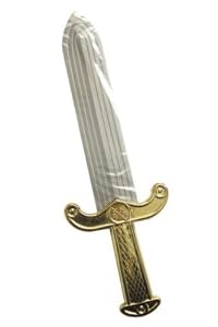
Overall filming in the studio went extremely well and we have some really good footage and photos we can use in our final products.
During the shoot we went through the song numerous times to get a variety of shots and angle's, some where close up, to the side and far away. We had shots of me on the floor performing, stood still and moving around. We also did a shot of me covered in water, this was featured in a lot of videos I have researched throughout the year, and looked very convincing.
The filming we did in the studio will be used cutting in and out of the music video, in between narrative in the church and performance out in the forest.
We also did a photo shoot to add images to the website, and some of the shots could be used potentially on the digipak. The shoot consisted of still shots of me, and also me with props such as a skull which looked really cool and me with a sword. We also did a shot of baby dolls heads in a row that we could add into our music video or use for the digipak, this looked really creepy and weird which suits our genre and can also be linked to our narrative in our music video as he murdered a girl.
Overall filming in the studio went extremely well and we have some really good footage and photos we can use in our final products.
Thursday, 6 November 2014
Band name.
Me and Toby have decided on a band name: Lost Cause. We thought it suited the track and lyrics as my character in the video is sort of a lost cause, it means an individual that can no longer hope for things to be changed for the better. This links to my track in a way as my character has no hope and commits a murder ect. Another reason for choosing the name is because its simple and sticks in peoples heads it also sounded pretty cool. I may also make a logo for the band so I can feature it on the website and digipak.

Here is just a font idea, I thought this looked cool because it has a cross as the t which suits our track very well.
Digipak imagery.
This digipak is very usual as it is all black with two distinct images, however the imagery used is very well constructed and looks great. The imagery used might be something I might think about creating however not to this extent. I may well get different images and put them together. Although this digipak is very simple it looks the part and I actually quite like how spacious it is and you focus on the image and it looks mysterious and vacant which is a vibe I want to give off on my digipak as this would match my website which is also just black and open. This links to my track as it is very spiritual and features words such as cold and lost. I could have an image of me kneeling down in the towards the side of panel with it all being black. Other ideas I have are bringing blood into the concept and religious imagery which is featured in the video.

Starting on the Digipak.
In todays lesson we thought about the construction of Digipak's as we are going to create one for our ancillary task. I have done some previous research on Digipak's in my genre and have some ideas of the conventions of Digipak's. However I also want my digital to be unique and not too bland. Sir brought in some of his Digipak's and we took a look at some in person. Here is what I thought of them:
The first Digipak I picked up was from an album by black Sabbath a rock band. This Digipak will have similar conventions of mine due to it being rock, however not exactly the same. As you can see the front cover has an image of coffins in a desert/Moore, the dark lighting would suit my genre, I also am thinking of having distorted images on my panels, maybe of religious type things we have took photos of. The font is a bold white and looks futuristic but with a creepiness too it. The front panel also displays what tracks are on the album and how many CD's are inside. Overall this cover is effective and suits the rock genre.
 The back panel has a list of tracks in the same font listed. It also has the logos of their record labels and all the copyright information (important stuff) which I will need to look into in more detail to find out exactly what is listed. And finally the barcode is displayed which is something we will also need to create.
 On this digipak the small print at the bottom lists where the album was made, the record group, copyright information and the bands website. Other logos are also displayed at the bottom, eg the bands logo, the production company logo and the official disc logo.

 The inside panel on the left features a nice photo of a band member on stage, which looks foggy and mysterious. The CD panel on the right features the disc holder, the disk itself is black with the same font printed on.
 Overall this digipak is simple but still looks good, I would probably follow the black theme and I like the foggy dark look. On the inside I could possibly have an image of me.
The next digipak I looked at was by an industrial metal band called ministry, which is again a similar genre to mine. The front panel is very artistic and unique. It features an angel in the centre on the panel with different clocks around the sides circling the angel. There is a white glow around the angel and the colours used make the album cover look old and scratched which looks great. There is also creepy objects like an eyeball and a dice ect. The band has the same black sticker on the front displaying the band name and album title. The font used is like handwritten block capitals, it looks like something used for the font of a horror film.
 The back panel is the same image but from behind, this gives the album a 3D effect and the panels link well together. The information at the bottom lists the records labels and copyright information, it also lists the addresses of the company's unlike the last one.
 The side panel is the same image on the front which I don't like as it gets repetitive. However I do like the CD for this digipak as it looks like an old clock.


The first Digipak I picked up was from an album by black Sabbath a rock band. This Digipak will have similar conventions of mine due to it being rock, however not exactly the same. As you can see the front cover has an image of coffins in a desert/Moore, the dark lighting would suit my genre, I also am thinking of having distorted images on my panels, maybe of religious type things we have took photos of. The font is a bold white and looks futuristic but with a creepiness too it. The front panel also displays what tracks are on the album and how many CD's are inside. Overall this cover is effective and suits the rock genre.
The next digipak I looked at was by an industrial metal band called ministry, which is again a similar genre to mine. The front panel is very artistic and unique. It features an angel in the centre on the panel with different clocks around the sides circling the angel. There is a white glow around the angel and the colours used make the album cover look old and scratched which looks great. There is also creepy objects like an eyeball and a dice ect. The band has the same black sticker on the front displaying the band name and album title. The font used is like handwritten block capitals, it looks like something used for the font of a horror film.
Overall the imagery on this digipak was great, however there wasn't much variation.
The last digipak I looked at was by the Young Gods. The album is orange throughout with a black/dirty tint to it. The front panel is striking however isn't something I would initially associate with the genre. I do like the font used with is a very bold and black, however maybe a bit too simple.
The inside panel shows who did what jobs to construct the album, for example it lists where it was recorded, where it was performed, who did the artwork ect. It also has contact information such as phone numbers and emails. In small font is who composed the album and published it.
The last panel lists all the tracks, and at the bottom there is again the barcode and copyright info.
I didn't really like this album cover, in my opinion is was way too plain and simple, however the good thing about it is that's its easily identifiable and perhaps links to the bands image well.
Looking at Digipak's in person has helped me get an idea of what they look as feel like, as well as some of the information displayed on the panels and what I need to include to make mine look professional and real.
Wednesday, 5 November 2014
Website Update.
After working on my website I thought I would share an update on how it looks and what features I have added ect. I have been working on tidying up how it looks and making it look more professional by re-arranging some of the pages and adding more apps such as social media sites and cool widgets.
 I have made some adjustments to my homepage to make it look more neat and tidy, for example I have started out by removing the things from the side of the page such as the news reel and random social media and app links such as Spotify and YouTube. The reason I have done this is to make it look more appealing as the crowded sides took the look away from the website and I want it to look simple and spacious. Features I have added include a Login/Sign up button which makes the website look legitimate as all websites have this feature. As you can see the striking difference is the countdown clock in the middle which tells the audience when our new single is released, I thought this looked cool so I added it. I have also added dual ITunes and social media logos to make everything look balanced and not all over the place. The homepage is still a work in progress as I am still experimenting with new features, however it is starting to come together, I may well change it in the next few weeks.
 The tour page looks roughly the same apart from some minor changes and additions, for example I changed the for this page to make it look clearer. I also sorted out sixing issues, I made each box and title the same size by copying them, this way I can ensure everything is symmetrical and looks smooth. Moreover I added a pay pal symbol to make it look like the fans can buy tickets.
 I decided to make a separate page for news with all the updates on a separate page as I thought this would look better. I put this page under media which is still not yet completed due to footage and pictures that I haven't got. This page needs improving, I need to change the font and colour as it is too dark, make more news and get better pictures.

The final page in the shop page, which I am happy with, the only thing I added was a PayPal button.
Overall website creation is going well and I'm working on it throughout lessons to make it the best it can be.
The final page in the shop page, which I am happy with, the only thing I added was a PayPal button.
Overall website creation is going well and I'm working on it throughout lessons to make it the best it can be.
Filming Finished.
Over half term we successfully filmed a large part of our music video. The shoot went very well and we got a range of shots, angles and settings. We shot mainly performance in the forest and the church with a small section in a graveyard. We also filmed some narrative in the church and the forest (the priest section).
However it wasn't all straight forward as we did have an issue while filming, all of our SD card's filled up during shooting, we thought we had not filmed a section of what we had done so we did it again. This was not the case so we not have twice the footage, but its better having more than less I suppose.
I also filmed some narrative and performance in my bathroom, I use fake blood and filled the sink with it as well as wiping it down my t-shirt. I tried to get a dark lighting so it looks more scary and mysterious, I used two candles and switched the light off, I did this because I thought it would look better and I didn't want you to see how modern my bathroom was, as it is supposed to look old. However it may be a bit too dark, but we will have to see.
Overall it was a success, we are now currently editing the performance section of the video and we will add the narrative in at a later stage, after we have done a shoot in the studio and at the pond at Toby's house as we didn't manage to get to do the pond shoot over half term.
I also did a couple of vlogs while out shooting to put on the media page of the website, we will also do a photo-shoot in the studio next week while filming to add to the website and make it look professional.
However it wasn't all straight forward as we did have an issue while filming, all of our SD card's filled up during shooting, we thought we had not filmed a section of what we had done so we did it again. This was not the case so we not have twice the footage, but its better having more than less I suppose.
I also filmed some narrative and performance in my bathroom, I use fake blood and filled the sink with it as well as wiping it down my t-shirt. I tried to get a dark lighting so it looks more scary and mysterious, I used two candles and switched the light off, I did this because I thought it would look better and I didn't want you to see how modern my bathroom was, as it is supposed to look old. However it may be a bit too dark, but we will have to see.
Overall it was a success, we are now currently editing the performance section of the video and we will add the narrative in at a later stage, after we have done a shoot in the studio and at the pond at Toby's house as we didn't manage to get to do the pond shoot over half term.
I also did a couple of vlogs while out shooting to put on the media page of the website, we will also do a photo-shoot in the studio next week while filming to add to the website and make it look professional.
Thursday, 23 October 2014
Roles.
For the Music video we wanted to have a reliable cast and a set of professional production members. We picked Jacob Flowers (me) for the main role after auditioning a list of Hollywood actors such as Robert Downey junior, Vin Diesel, David Hassellhoff, Brad Pitt and Jonny Depp.


In the end we went with the most talented actor after a rigorous auditioning process which was me, this would be the obvious choice.
We also hired another actor for the priest, we went with Toby as no other priest was available and he looks like a middle aged man.
We hired my brother to help out behind the scenes with filming and running Erin's such as getting us bagels, water and occasionally fanning us to cool us down.
Lastly we hired Imogen (Toby's sister) to be the girl who gets killed.
Subscribe to:
Posts (Atom)